Friday, November 16, 2018

4 websites

the escher staircase

1. I learned about a German photographer who travels across Europe in search of abandoned stairwells. I also got to look at some of the photos he has taken on his journey and the photo above is part of that.

2. I chose this photo because I feel like it is different than a lot of the photographs that he has taken. The staircase looks more out of shape and different.

3. The rules that I can see in the photo are maybe lines and maybe balance.

4. The photographer of the photo is Christian Richter.

walking

1. I learned that many people take care of special or important events in other people's life but not of their own. Also that if many people did have a photo of them and their family it would be awful ones taken by their iphone.

2. I chose this photo because I feel like it relates to many and or everyone's life and how that we have our life ahead of us and still a long way to go.

3. Some rules of photography that I see in the photo are lines and balance with all the mountains and the woman walking.

4. The photograph was taken by Jenna Martin.


6photos_2

1.

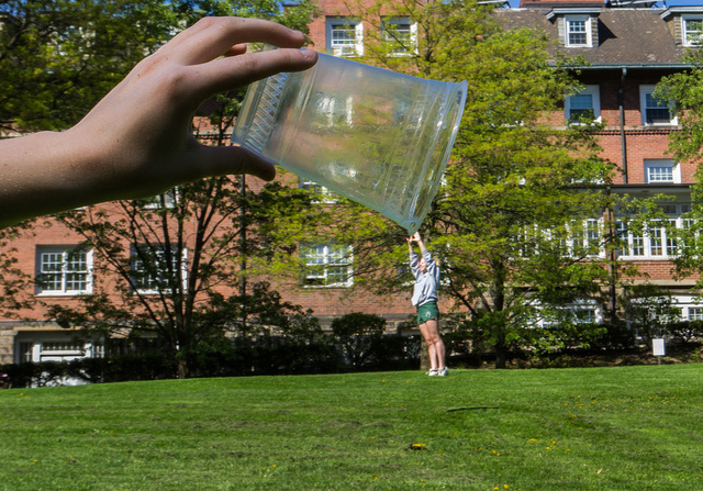
2. I chose this photo because I like how they used balance in the photograph but in a different and unique way.

3. Some rules of photography that I see in the photo are balance and maybe lines from some of the window and other parts of the house.

4. The photograph was taken by Jeff Meyer.

3SussmanAntarcticMoss.jpg

1.

2. I chose this photo because I like how the entire photograph looks blue from the ocean and also how the mountain are like part of two different seasons.

3. Some rules of photography that I see in the photo are simplicity and maybe balance of the ocean and mountains.

4. The photograph was taken by Rachel Sussman.


prompt shoot #3

1.
Connected
2.
Footprint
3.
Pause
4.
Eight

Wednesday, November 7, 2018

Magazines Part 2

Image based cover types are the most common for magazine covers and are usually of one or few people looking into the camera and smiling. Illustration based cover types were more common back in the day but are still sometimes used. Today they are basically an illustration of something funny or out of the ordinary. Type based covers are also pretty rare but are more common then illustration covers. They are covers that relay on words and text more than photography to get the message to people. Concept based covers kind of mix every other cover concept together. They have to be instantly understandable for the audience which can be difficult to make sure that the readers will know what is being stated. The relationship between words and photos is that they work to create a cover on their but can be used to make the cover better but you also have to be sure that they work together to make sure that the readers will understand what is being said.

Favorite


Billboard
“Woman of the Year 2017: Selena Gomez,” December 9, 2017
Nicole Tereza, Designer
Ruven Afanador, Photographer
Jen Laski and Jenny Sargent, Photo Directors
"Billboard’s annual Women in Music issue was led by a stunning figure of poise, strength and beauty: Selena Gomez, who had spent the year blossoming into a progressive pop artist, covers the issue as the Woman of the Year. Photographed at the Paramour Mansion in Los Angeles by Ruven Afanador, Gomez’s delivers a look that pierces through the adult opulence surrounding her; she’s come a long way since her Disney days, and her regal pose signifies her newfound power. Showcasing one of Gomez's most personal interviews to date, the cover underlines the unbreakable spirit at the heart of the story."

This photograph was taken to show how much this now popular pop star has blossomed into the woman that she is today. This is communicated through the photograph by giving her that adult presence to pull her away from her old Disney days, and her pose is supposed to signify her newfound power. The composition consists of nice velvet furniture and older more valuable furniture. The lighting is brighter in certain areas while being almost darker in other areas. I think this helps bring the singer more into focus, to stand out better. The exposure of the photo is, I think, almost neutral to maintain and draw her away from the Disney girl she once was and into more of that famous adult she now is. 

Best Magazine Covers 2018

1. Informal

2. Informal

3. Informal

4. Informal

5. Formal

6. Formal

7. Informal

8. Environmental

9. Formal

10. Environmental

11. Informal

12. Formal

13. Formal

14. Environmental

15. Formal

16. Informal

17. Environmental

18. Formal

19. Formal

20. Formal

21. Formal

22. Formal

23. Informal

24. Formal

25. Environmental

26. Informal

27. Informal


Monday, November 5, 2018

Magazine Tips

1. When doing something different and the background stands out and it's well enough so leave it alone.

2. The cover will lack scale because it's in the electronic world and don't have anything real to compare it to, you can guess and hope their okay.

3. Cover are the prime tool for selling and should be judged realistically for both its content and for its form.

4. If your cover doesn't pop or is almost invisible you should chose a dominant element by enlarging, by isolating, by using more controlled color and more.

5. Finally the cover should make people curious and draw them to it.